
Nutrition for Longevity
Precision nutrition, beautifully designed from DNA to dinner plate.
Nutrition for Longevity (N4L)
Case Study · 2025
About this product
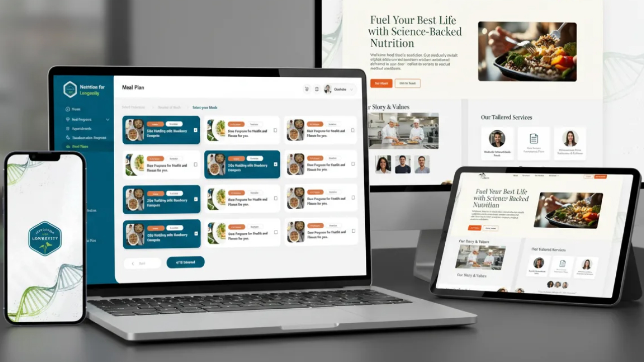
End-to-end UI/UX design for a personalised nutrition platform combining DNA-based meal planning, expert coaching, a healthy food marketplace, and community features.
Timeline
12 weeks
Category
UI / UX
Delivered
2025
Stack
Product Preview
Overview
The situation
Nutrition for Longevity (N4L) was building something genuinely ambitious: a science-backed platform that combined personalised meal planning based on DNA and lifestyle data, one-on-one nutrition coaching, a curated healthy food marketplace, and a community layer to sustain long-term habits. The product vision was compelling. The design challenge was equally significant how do you make something this complex feel simple, intuitive, and motivating to a health-conscious user who just wants to eat better and live longer?
Challenge
What we had to solve
The platform had to unify four fundamentally different product surfaces a personalised meal planner, a coaching interface, an e-commerce marketplace, and a community hub into a single, cohesive experience that felt seamless rather than stitched together. Each surface had its own data model, its own user intent, and its own interaction patterns. The design system had to hold all four together visually and functionally, while the individual flows had to feel light and purposeful rather than overwhelming. Health tech is also uniquely high-stakes for trust: users were sharing DNA data, health metrics, and personal goals the design had to communicate safety and scientific credibility at every touchpoint.
Onboarding & DNA Intake Flow
Personalised Meal Planner
Coaching & Marketplace
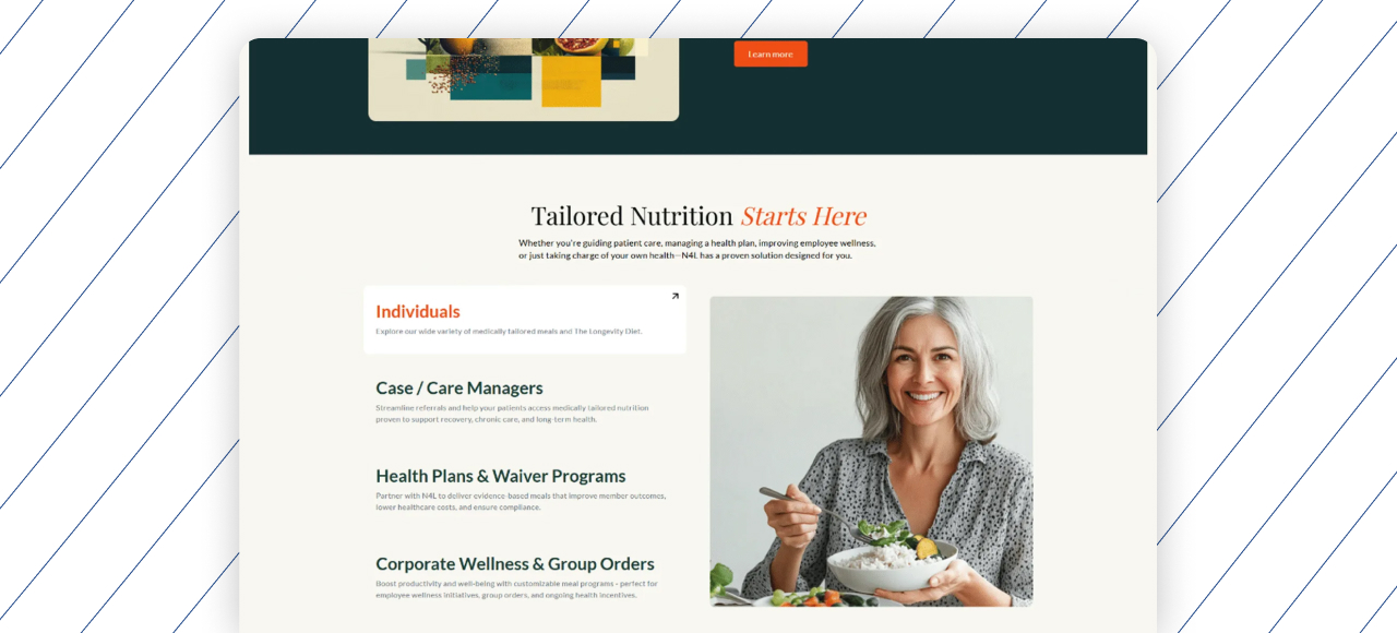
Community & Recipe Library
Case Study
How we built it
User Research & Journey Mapping
We began with structured research into the health-conscious consumer their motivations, their frustrations with existing nutrition apps and meal kit services, and the moments where they typically disengaged from wellness products. Three core personas emerged: the precision health seeker who wanted DNA-driven recommendations, the busy professional who needed coaching without the friction, and the community-driven user who stayed consistent through social accountability. Every design decision that followed was anchored to one of these three.
Information Architecture & Design System
With four distinct product surfaces to unify, the information architecture was the most critical early decision. We mapped the full content hierarchy, user flows, and cross-surface navigation patterns before touching visual design. A comprehensive design system was then built in Figma covering typography, colour tokens, spacing scales, component library, iconography, and interaction states ensuring that every screen across meal planning, coaching, marketplace, and community shared a consistent visual language and behaviour pattern regardless of who built it.
Wireframes & Low-Fidelity Flows
We produced detailed wireframes for every core user flow: onboarding and DNA/lifestyle intake, personalised meal plan generation and editing, coaching session scheduling and communication, product browsing and checkout in the marketplace, and community feed and recipe library interactions. Each wireframe was reviewed against the original persona needs and iterated before progressing to visual design ensuring the logic was sound before any aesthetic investment was made.
High-Fidelity UI Design
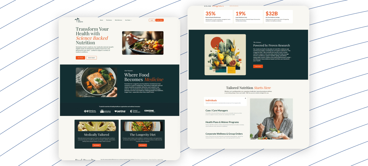
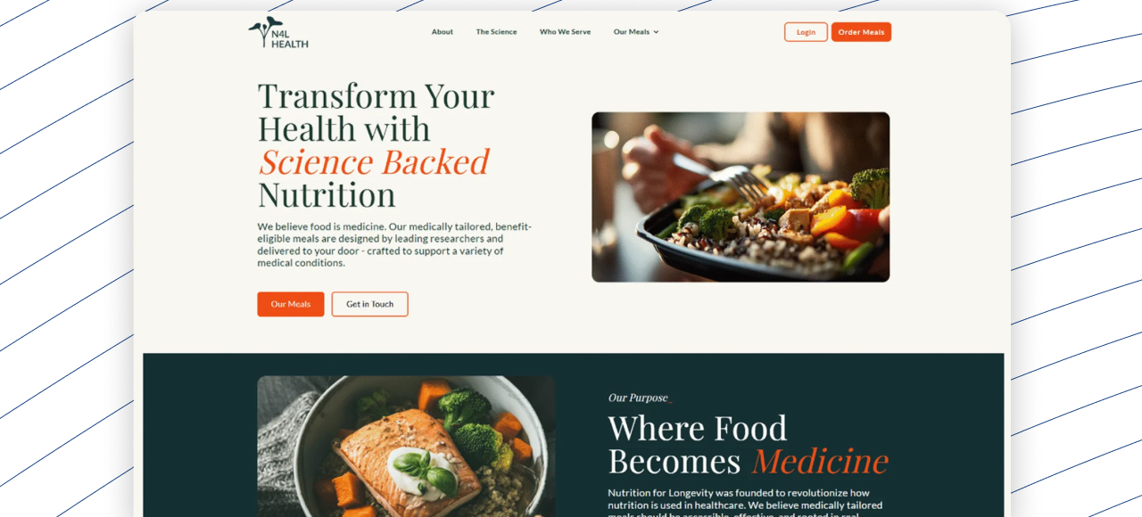
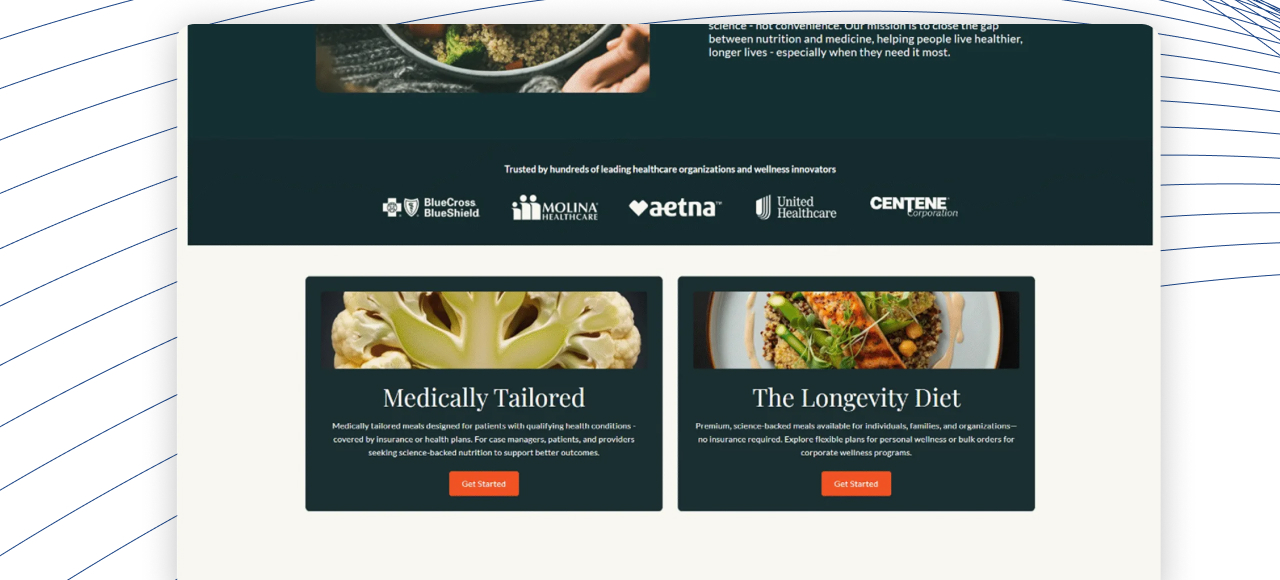
The visual design language for N4L was built around science-backed warmth clean, clinical enough to signal credibility, but soft and organic enough to feel approachable and life-affirming rather than medical. Deep greens, warm naturals, and generous whitespace anchored the palette. The meal planning interface used card-based layouts with clear nutritional breakdowns. The coaching dashboard was designed for clarity and human connection. The marketplace was designed to feel curated and intentional, not overwhelming. Every screen was built to high fidelity in Figma with full component usage.
Prototyping & Usability Testing
Interactive prototypes were built in Figma for the four primary user journeys onboarding to first meal plan, booking a coaching session, completing a marketplace purchase, and engaging with the community recipe library. These were tested with six representative users across the three personas, generating structured feedback on navigation clarity, information hierarchy, and task completion confidence. Two rounds of iteration were run before the designs were signed off for handoff.
Design Handoff & Design Documentation
A comprehensive developer handoff was prepared covering component specifications, spacing and grid documentation, interaction annotations, responsive behaviour guidelines, and asset exports for the React front-end. GraphQL API data structures were mapped to UI components to bridge the design-engineering gap cleanly. The complete Figma file, design system library, and handoff documentation were delivered, giving the development team everything needed to implement the designs with precision and without ambiguity.
Outcomes
Four products. One seamless experience.
4
Product surfaces designed
meal planning, coaching, marketplace & community
3
Core personas researched
precision seekers, professionals & community users
92%
Task completion in usability tests
across all four primary user journeys
2
Rounds of usability iteration
before final design sign-off
100%
Component-based design system
full Figma library ready for handoff
12wks
Full design delivery
research to handoff-ready Figma files
N4L was a complex product with a lot of moving parts four different features that all needed to feel like one product. The design team understood that challenge immediately and delivered something that was both scientifically credible and genuinely beautiful to use. The handoff documentation alone saved us weeks of engineering time.
Nutrition for Longevity (N4L)
Client, Health & Wellness Platform
Want results like these?
Let's talk about what we can build together.